Power BI is a tool used for generating business intelligence reports, charts and graphs, that incorporate easy to understand visuals. It is a self-service BI tool that is particularly useful for data analysts who create and distribute BI reports throughout the organization. With moderate knowledge of SQL, one can develop simple power BI visuals after only very basic training.
The first important point is that it is essential to determine the Storage mode before starting to develop any power BI report. Storage modes that can be used for accessing the data can include:
- Import mode
- DirectQuery mode
- LiveConnect mode
- Push mode
My experience in developing a power BI report increased quickly, as I started by developing a very simple report and ended up learning a huge amount about more advanced elements of Power BI as the project requirements changed.
In the beginning, it was exciting to work on the first simple power BI report, which I developed using a database like SQL Server and Storage mode as Import.
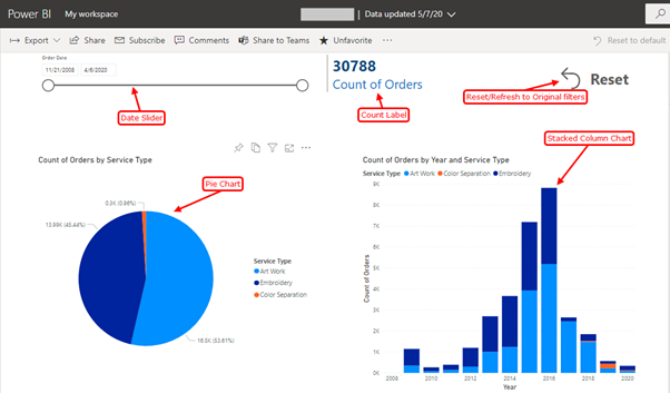
As shown above, the visualisation was for a count of orders for the time period indicated by the date slider. The stacked column chart on the right shows the orders based on service type on a yearly basis. The visualisation can be done for any date hierarchy including daily, weekly, monthly, quarterly and yearly. In the pie chart on the left, the total orders are shown as both a total count and a percentage breakdown. As specifically requested by the client, we also added a reset button to restore the initially selected filters values.
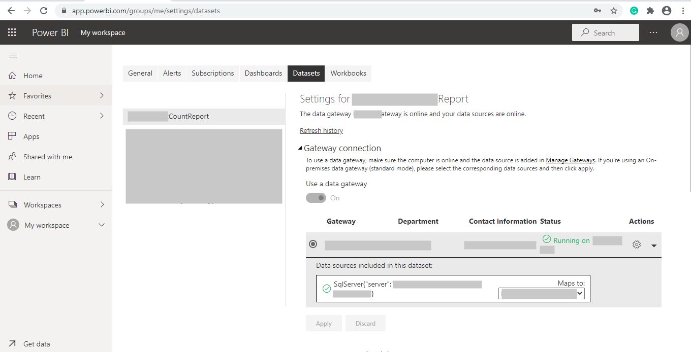
Later on, during the deployment phase, we had to search for an on-premises data gateway to maintain the continuous connection with the data relying on the SQL server. We installed the on-premises data gateway on our database server connecting to the datasets created on the Power BI portal as shown below:
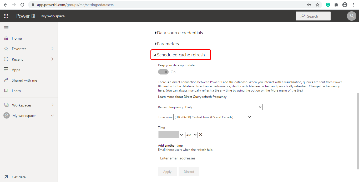
We maintained daily refresh schedule as shown below:
After deploying this report to production, the client requested a live report that showed current statistics without needing a page refresh. After some research I found that automatic page refresh can be achieved using the DirectQuery Storage mode. Unfortunately, my report was developed using the Import mode. This is when I learned the hard way that choosing the right storage mode from the beginning is very important, as I had to recreate the whole report using the DirectQuery storage mode. Meeting the clients’ needs required converting the storage mode to Direct Query, recreating the report and setting the automatic page refresh option to 5 seconds.
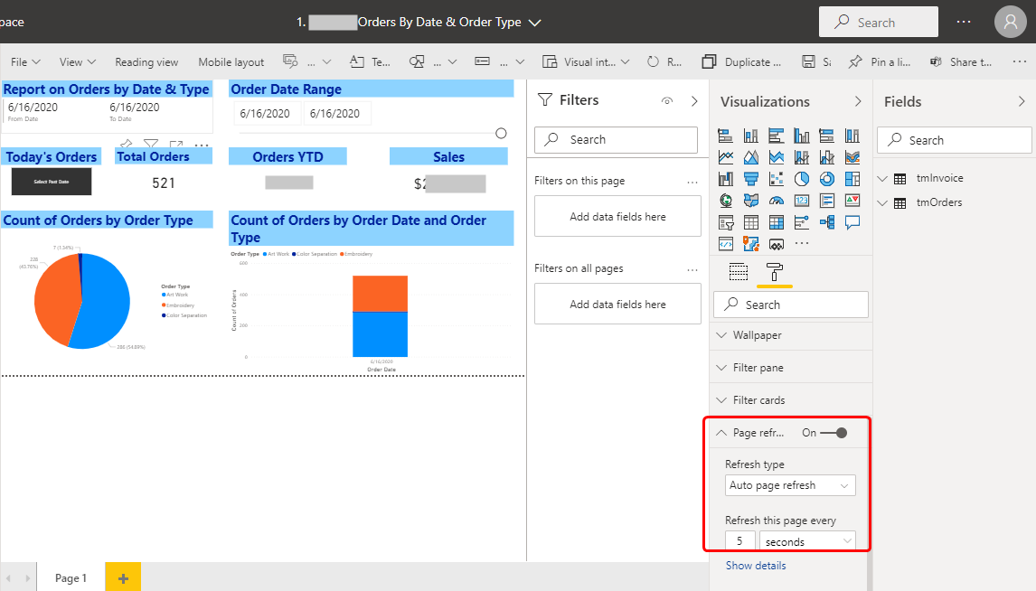
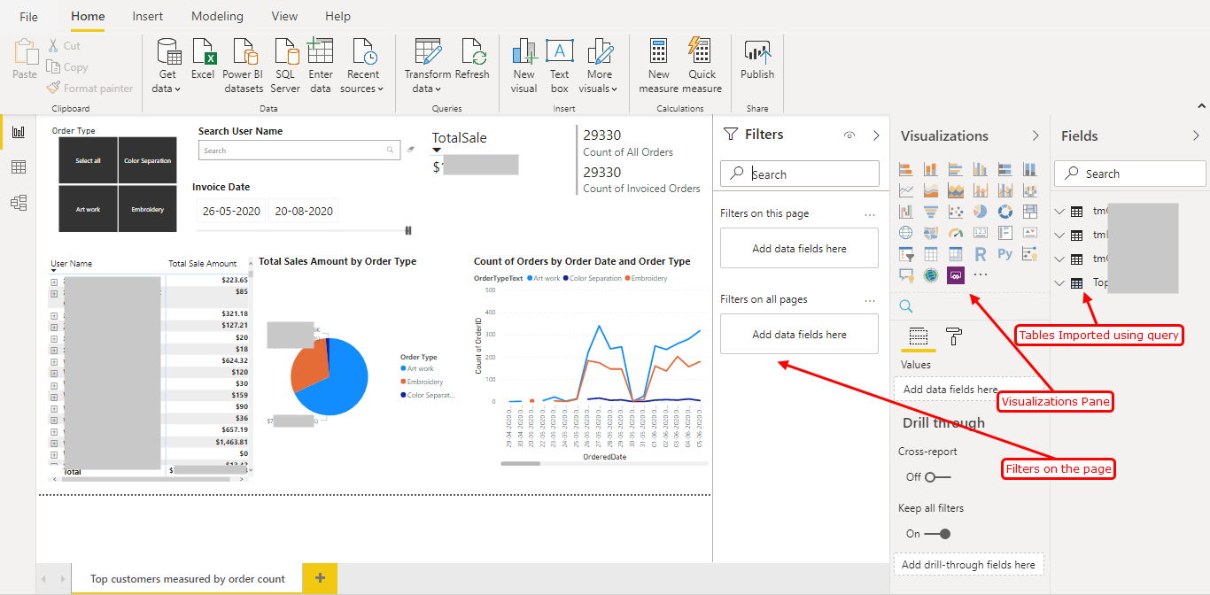
We can develop a variety of reports using the Visualization options as shown in the image below.
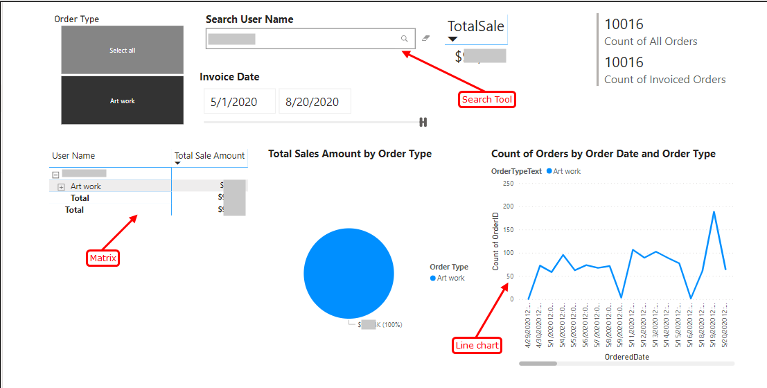
We can even use visuals other than those available in the Visualization pane, such as the Search tool shown below:
At MetaSys, we are focused on investing time into new and innovative projects like Power BI, to meet our clients’ needs.
For more information refer to https://www.metasyssoftware.com/contact