Tracking KPIs, metrics and any other relevant data is important for any business looking to improve their performance, and proper visualisation can be helpful for identifying trends and patterns. A useful information management tool is a dashboard, which can be used to provide a graphical summary of all relevant information. This article details a recent project, in which we successfully built a dashboard for a client using Google charts.
Case study
Our client wanted a way to efficiently track day to day reporting, check the status and progress of different tasks, and financial metrics like revenue, costs and profit-loss data. Previously, they had to access several different reports to analyse the overall business performance. We built a dashboard that allowed them to visualise the day to day business activities on a single screen, saving time and energy.
We decided to use Google Charts for a number of reasons:
- Google Charts are a good tool for visualization as the graphics are highly interactive.
- There is a large gallery of chart types that allow for a lot of customisation for representing different kinds of data.
- It is compatible with different browsers.
Technology and Implementation
For the implementation of the dashboard we used jQuery and ASP.net. These technologies are easy to use, and allow for easy rendering of the page. Furthermore, Google Charts have an inbuilt library in jQuery.
Implementation steps of Google chart in ASP.NET
Before the implementation, all the Google Chart Libraries and the visualization API need to be loaded. The following procedure was used to include a chart in ASP.net:
- Create an html div to hold the chart as per our requirement.
- Ajax call for loading data in the chart
- Call the Visualization API before assigning it to the chart and set the chart options like legends and axis titles
- Assign the div id to the chart
- The call to the chart depends on the chart type (barchart, donut chart etc.).
- Call the draw method of the Google chart and set the chart option.
Chart examples
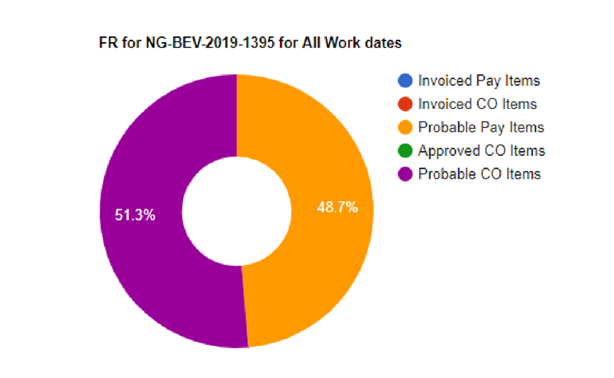
Donut Chart:

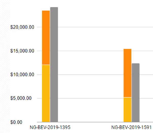
Stack Chart:

Matching client requirements
Our main challenge was to modify the chart to meet the clients needs. For example, the client specified that the revenue chart was to be displayed in a rectangular format without a legend, or axes. We identified the “Timeline chart” as the most appropriate chart option amongst the templates although it still required customization. We modified the inbuilt generated SVG code from JavaScript by specifying the position and width and by hiding the x- and y-axes to match the client requirements.

If you are interested in a similar implementation of data visualisation, feel free to contact us. Our team has extensive experience in handling diverse custom ASP.NET application projects. https://www.metasyssoftware.com/contact